


How To Build A Beautiful Green Cross Calendar Visual In Power BI
Effectively visualize data where each deviation should be clearly highlighted

Have you ever seen a Green Cross calendar built with native Power BI visual?

Well, now you have! A couple of weeks ago, I received a request to build one and was surprised to find out nobody seemed to have done it before. Or, I found a few attempts, but the appearance of those visuals was, to say it politely, "non-optimal" 💩. So, what do you do when you face a situation like this?
You build it yourself!
What Is A Green Cross Visual
The Green Cross (also known as Safety Cross) is a visual tool commonly used in workplace safety management to track incidents.
The visual uses a cross-shaped grid with 30 or 31 squares—one for each day of the month. Each square displays a color: green for accident-free days, and red or yellow for days with incidents, depending on their severity. But why a cross shape? I'm guessing it has something to do with the green cross being a universal symbol of health, but who knows 🤷♂️.
Besides, if business wants a cross-shaped calendar, that is what they shall get.
So, let’s build one with Power BI!
Customize Your Date Table
The first thing you need to solve is the challenging layout of the days.
Luckily, I just happened to play a couple of rounds of Battleship with my daughter a while ago. As you probably know, in this game players take turns guessing coordinates on a grid to try to sink each other's ships 🛳️💥. You can use exactly the same logic to build coordinates of your Green Cross.
Here’s what it looks like quickly drafted in Excel.

Now, to be able to add row and column coordinates to your date table, you first need to have a column representing the day number for each date, which is easily added in Power Query 👇

With the day number column in place, use the amazing piece of Excel art 🖼️ as your guide, and add two conditional columns to your Date table, one for row coordinates, and one for column coordinates (I called these columns GreenCrossRow & GreenCrossColumn).
For example, if the day number is 17, then both row and column coordinates should be 4. Example of adding a conditional column below.

Now you have everything you need to start building the actual visualization.
Build Your Green Cross Shape With A Scatter Chart
Creating a Green Cross requires flexible formatting settings.
The visual that provides you with most options is the Scatter chart. Here are the high-level steps I took to make the visual fundamentally look like a cross:
Populate With Conditional Columns — Add the GreenCrossRow column to Y-axis and the GreenCrossColumn column to X-axis. Make sure the default summarization of these columns is set to None.
Disable Axis Values & Titles — Simply because in this visualization those are just clutter and not adding any value.
Set Size For Markers — Play around with the size multiplier under Markers section in the Format pane an choose how big you want to make the bubbles.
Lock Axis Values — To create some whitespace around the Cross, lock both Y-axis and X-axis to minimum of 0 and maximum of 8 (because coordinates are always something in 1-7 range).
Invert Y-axis — The days will appear in the wrong order by default. To fix this, invert the Y-axis to flip everything upside down 🙃.
Add Titles — Add a clear title and preferably a dynamic subtitle using DAX to clearly identify which month we are talking about. Center alignment looks best for the titles if you ask me.
Style — Apply some styling such as padding to the inside of the visual, round the corners & add borders to the bubbles. It’s up to you to decide what good looks like.
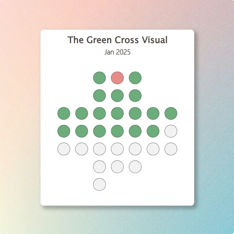
After completing the above steps, your visual should look somewhat like this 👇

Now it already looks like a cross, but isn’t it supposed to be a GREEN cross, not gray?
Color The Days Using Conditional Formatting
To add conditional formatting to the visual, first add a simple DAX measure with 3 possible outputs.
1 = The day is in future (and should be formatted gray).
2 = The day is in history and has incidents (and should be formatted red).
3 = The day is in history and has no incidents (and should be formatted green).
In case you’re wondering about the [Incident Count] measure, it’s simply a COUNTROWS of the massive one row, one column fact table used in this post. So don’t worry about the performance even if your still rocking Windows 95.

Next, go to the Color section under Markers in Format pane and add conditional formatting with the help of the image below.

And boom, now you have some colors 🎨 and the cross looks instantly better! Colors used:
Grey — #EDEDED.
Red — #DC5B57.
Green — #2D8A43.
Also, while you’re adjusting the color of the markers, set the transparency to 30% (for a reason you’re going to find out next)
Next, let’s display the day numbers inside of the bubbles by tweaking the setting…. which does not exit.
Damn 😩. The only option is to use the Category labels, but that will place the labels automatically below the bubbles which is simply not good enough for the visual we’re building.
So how can you work around this?
Create A Plot Area Background For Your Visualization
Now, you might create a Matrix visual that displays the day numbers and place it over the Scatter Chart.
But… What if you want to easily copy the visual to another pbix file when using the Golden Datamodel approach, or embed it to a PowerPoint presentation? For that, you need a single visualization.
So, instead let’s turn to one of the most underused formatting settings in Power BI: the plot area background. If you’re a long-time reader of Power BI Insider, you might remember that I used plot area background also in the article: How To Build The Ultimate Benchmarking Bubble Chart With Custom Diagonal Lines. And it’s the perfect solution to display the day numbers (plus make the last row of the cross shape fully complete).
To create the background image, I recommend using Figma—it's like PowerPoint and MS Visio had a superhero baby 🦸.
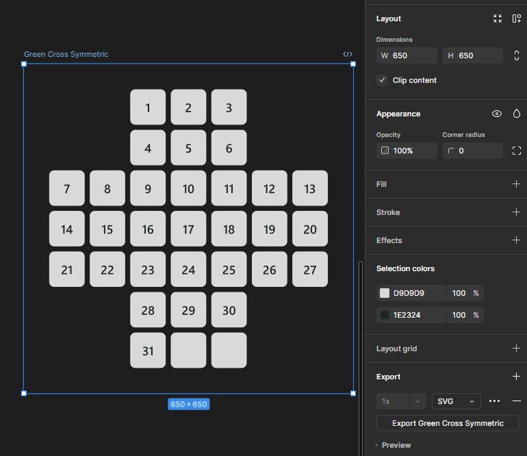
The steps in Figma are super simple:
Create rounded Rectangles in shape of a cross with symmetrical spacing.
Add Text Boxes inside each rectangle with the day number.
Create a Frame and align everything in the middle of it.
Optionally, remove background fill from the Frame.
Export the image as SVG (included in the example files for Subscribers).
After this is done, place the SVG image to the Plot area background and change the Image fit setting to Fit.
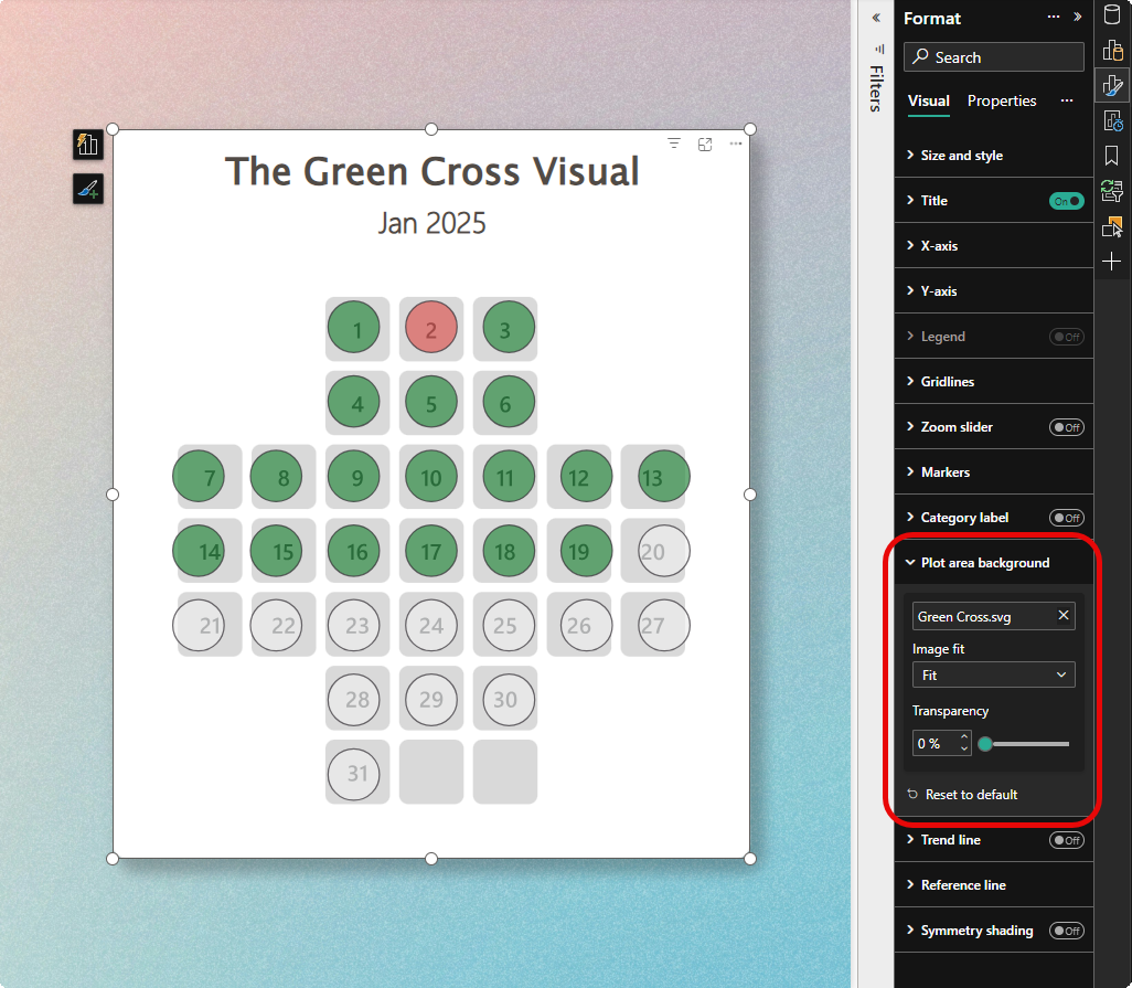
Unfortunately, the plot area background is not fully symmetrical like the Figma design, and because of that the bubbles will not align by default with the background image.
But you can fix this easily by doing the following three steps:
Resize the visual by dragging from the corner and try to align the bubbles over the background. But if that doesn’t work…
Tweak both Y-axis and X-axis min and max values to position the bubbles exactly on the right spot.
Lock aspect ratio of the visual so that future resizing will not distort the visual.
And now, the visual is complete! (Btw, looks like there has been an incident right after new year’s celebration. Coincidence? Maybe 🤔…)

How To Take This Solution Even Further
To wrap up today post, a few ideas how you might build on top of this solution.
Details — You probably want to know the details of the incidents. You could solve this by using a dynamic tooltip page, a drill through page, or a simple table on the same page that cross filters by clicking on a red day.
KPI — To enrich this visual, you might create a KPI that calculates to count of days since the last incident, which could be easily achieved using DAX time intelligence functions. Don’t break the chain! ⛓️💥
Heatmap — Instead of traffic light coloring, you might try Gradient conditional formatting to fill the bubbles, for example to highlight the days with most sales.
Scale — Make 12 copies of the visual and set a visual level filters for different months and page level filter for the year. This way you could easily display the full year of crosses and not just one month.
Can you think of some other ways to use this visual?
Thanks for the great walkthrough, works like a charm! 👍🙏