
How To Use Power BI & PowerPoint For Dynamic Follow-Up
Combine automated Power BI data & manual comments in PowerPoint

Follow-up in business is crucial.
It’s a great way for monitoring ongoing progress and provides the opportunity to stop, reflect, and address any issues that may have arisen. These continuous 1% course adjustments make sure your plane lands on the correct airport 🛬.
While Power BI is a great tool for visualizing the development of business metrics, it offers only a limited set of features for commenting and storing a snapshot of those comments. Fortunately, you can work around this limitation by leveraging the native Power BI integration in PowerPoint.
It looks like this 👇

If this is something you’d like to learn build yourself, read on.
Design the Power BI report
First things first, we need something to follow-up.
The example KPI used in this article is gross profit, a key metric for many companies. If gross profit is a new term for you or need some inspiration what else you might follow up, I suggest you take a look at this article.
The example Power BI report consists of two visual elements, a KPI card and a clustered bar & line chart.
Step #1: KPI Card
In the final result, we want Power BI report to take half of the slide.
For that reason, before creating the KPI card, adjust the width of your Power BI canvas to 50%. this is possible since both Power BI and PowerPoint use the same default aspect ratio.
Also, I recommend changing the canvas background to light grey.
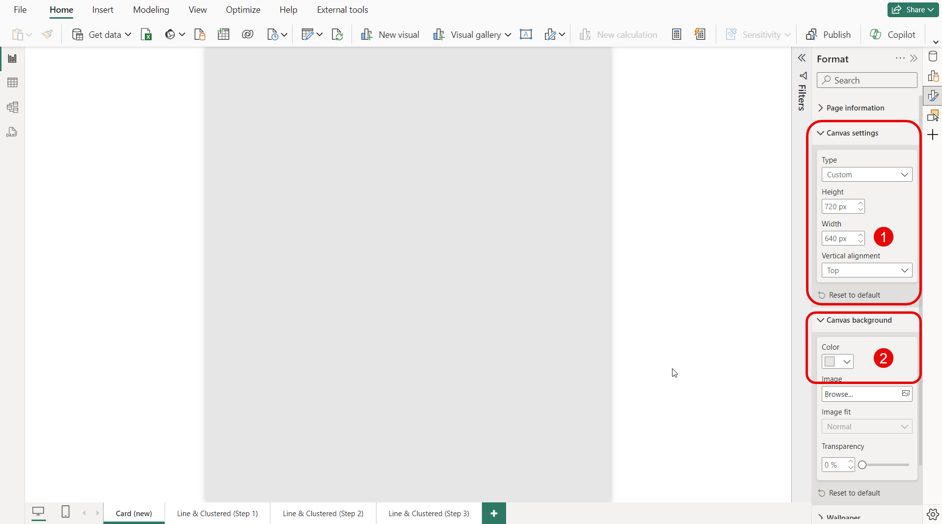
After prepping the canvas, dedicate roughly 1/3 of the available space for the KPI card.
I’ve used the Card (new) visual in the example since it provides a mind-bending 🤯 amount of customization possibilities, including multiple reference labels, dynamic color formatting, and the possibility to use a picture next to the main KPI.
Another alternative is to use the KPI visual in case you want to save a little time in building the chart.
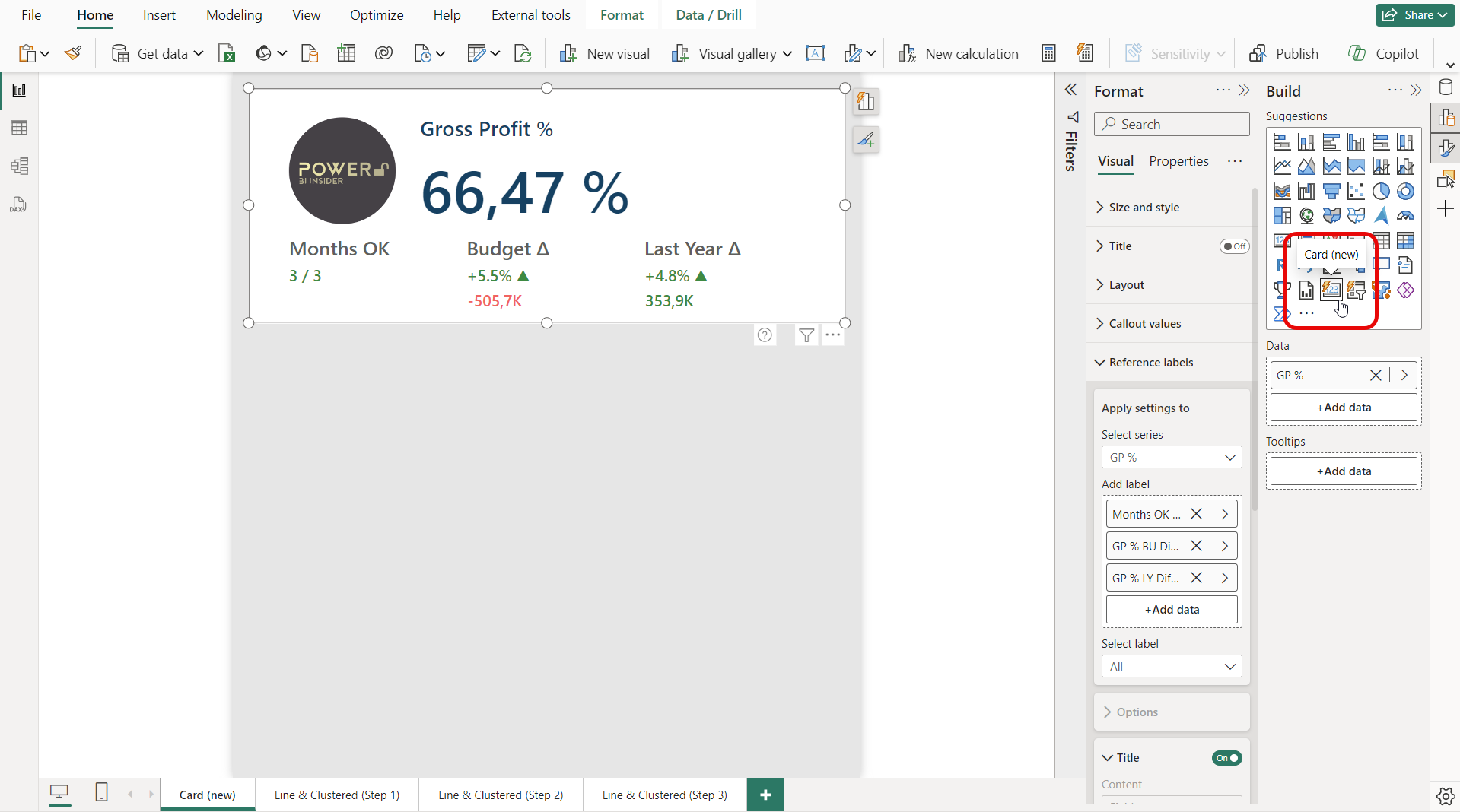
Here’s a quick overview of the elements built into the example Card.
Gross Profit % — The main KPI of the Card.
Months OK — In how many months was the goal reached?
Budget Δ — The difference to budget, both in percentage and in money.
Last Year Δ — The difference to last year, both in percentage and in money.
After you’re happy with the formatting of the Card, time to create the bar & line chart.
Step #2: Line and clustered column chart
Let’s first add a regular line & column chart to the canvas.
The overlapping column layout works great for displaying gross profit, budget, and last year values at the same time. But adding gross profit % and gross profit % budget to the line y-axis creates some trouble.
The top part of the chart becomes really crowded and hard to read.

It would be a lot nicer to create some space between the bars and lines.
Is it possible? Of course, but requires a little work around. The very first thing to do is to remove everything from line y-axis (1). After it, you want to add title / subtitle to the chart, make the font really big and white in color (2). This makes the title “invisible” and pushes the bars down.
Finally, move the legend from the top to the right (3).

Ok, but how do we get the lines back? 🤔
For this, we are going to add a standard line chart and place it over the bar chart (1). For best possible readability toggle the legend off and turn the series labels on (2). I recommend adding data labels for both lines as the axis values need to remain hidden to create a clean look.
Also, when doing tricks like this 🤹, remember to set proper layer order using the selection pane (3).

The final tweak I recommend for you to do is to add a help tooltip text that might be useful for the end users of the report.
Since, we’re creating an illusion of a single chart on the bottom part, only add the help tooltip for the bar chart, but not for the line chart.

Once that is done, time to publish the report to Power BI service and move over to PowerPoint.
Design the PowerPoint slide
In PowerPoint, start by adding a Power BI element from the Insert tab (1).
Then, simply copy the URL of your report from Power BI service and paste it in the box highlighted below (2), and click the Insert button (3).
This will live connect your Power BI report to the slide.

As said before, we want to dedicate 50% of the slide for the Power BI report. Simply drag the borders of the Power BI extension to resize it.

To create a unified look to the slide, you want to make the slide background the same color as the Power BI report.
To do that, simply go to the Design tab (1), select Format Background (2), choose Color (3), and use the Eyedropper (4) to select the same color that is used in the Power BI report.

Then, you can collapse the toolbar and hide the filter pane for the Power BI extension. After doing it, you slide should look like this 👇

Ok, we’re getting closer to the final look.
The last step is to insert a simple rectangle with rounded corners to the right part of the slide. Obviously, what you decide to write in it is totally up to you. I like the idea of having a few comments why the numbers are like they are, and what you’re planning to do next.
The bigger the gap to the target, the bigger the action required.

As I promised, in the beginning this PowerPoint file can be also used for storing follow-up snapshots. This way you will never lose how the data looked at the time of the follow-up, even if it has changed since.
Storing a snapshot is really easy. Simply expand the Power BI extension toolbar and convert the Power BI visual to Snapshot or Public snapshot depending on your security requirements and save the file.
The next time around you can switch back to using live updated data.

Alright, that’s a wrap 🌯 for today.
I hope this article contained a trick or two you hadn’t thought about before!