


The 5 Most Useful Power BI Posts Of 2024
Time to stop and make sure you didn't miss any of these gems 💎

In this special edition, we're going to celebrate 🎉 the past 12 months and take a look at the most useful Power BI Insider posts of 2024. The previous year brought many fresh insights, creative solutions & amazing visualizations.
Without further ado, here are your top posts of 2024! ⭐ (links in the subtitles)
#1: This Interactive Power BI Checklist Will 10x Your Company's Report Quality
The first post will teach you how to create a unique training resource with Power BI.
What you will learn:
Built-In Power BI Help — How to creatively use slicers and (new) card visuals to create a one-page checklist directly in Power BI.
Dynamic Video Tooltips — How to automatically display short videos or images when hovering over specific visuals on page
Help Tooltips — How to use written help tooltips to maximize the clarity of your communication
Next, multiple posts in 2024 talked about how to best visualize business performance.
#2: How To Build The Ultimate Benchmarking Bubble Chart With Custom Diagonal Lines
Your go-to visualization to understand business profitability and development.
What you will learn:
Bubble Chart 101 — How to best understand finance data with a bubble chart
Animate Historical Development — How to clearly visualize historical development using the play axis
Custom Diagonal Lines — What to do when Power BI doesn’t allow you to draw the lines you need in the chart
But this amazing chart wasn’t the only visual to analyze your business.
#3: This Is How You Analyze Top 10 Business Like A Pro
Your ultimate guide to visualize all key KPIs in one chart.

What you will learn:
Top 10 And Others — How to use this powerful analyzing technique to quickly understand the structure of any business
Bar Chart — How to use regular bar chart in ways you thought was impossible 🤯
Kill Pie Charts — The reason why you should eliminate your beloved pie charts
Moving on to yet another creative solution.
#4: How To Use Power BI & PowerPoint For Dynamic Follow-Up
Your top guide to combine live Power BI data with manual PowerPoint comments.
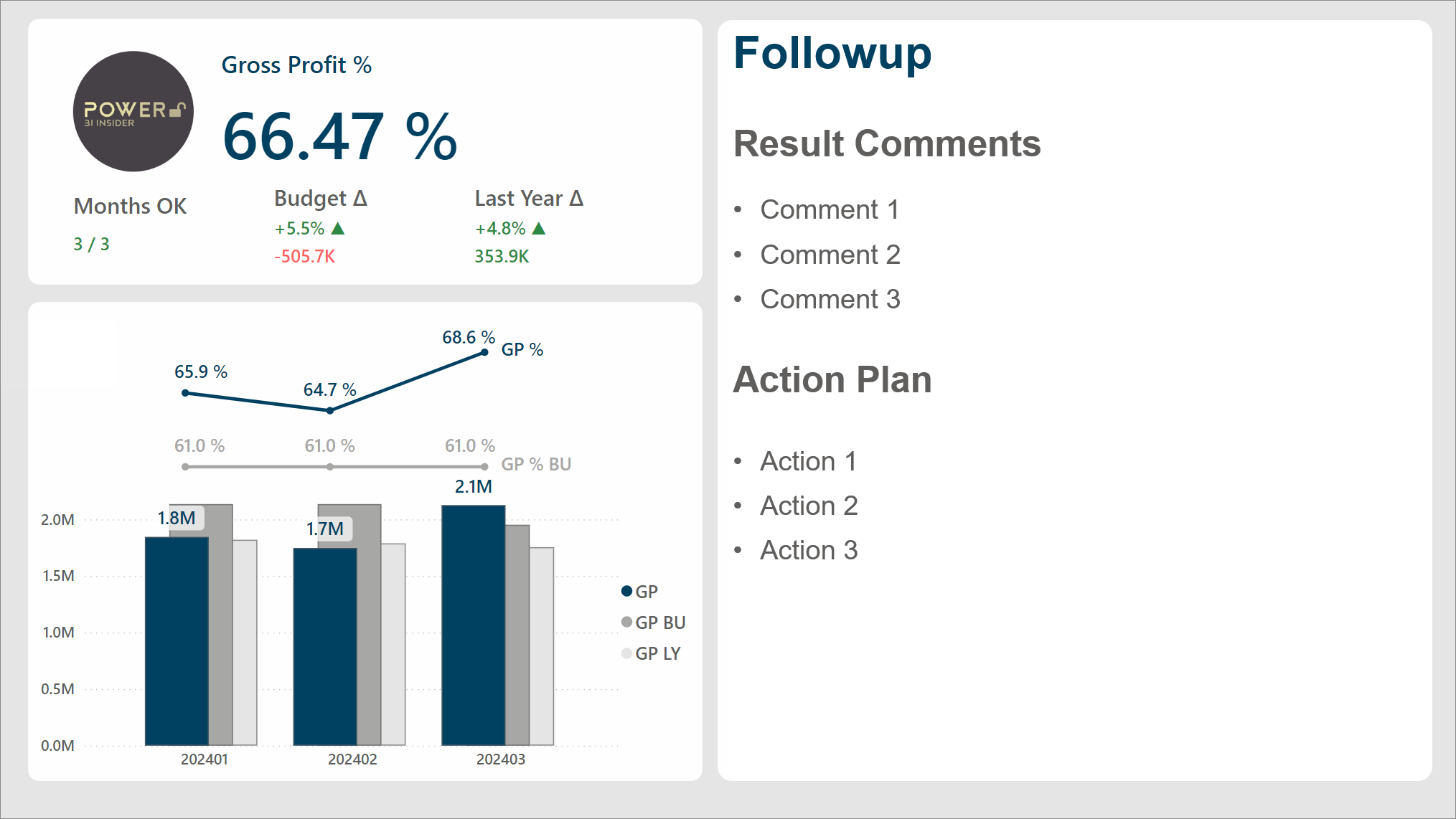
What you will learn:
Ultimate KPI Card — How to use the new card visual in a way that instantly communicates everything you need to know
Combine Manual & Automatic — How to get the best of both worlds by combining automatic data and manual comments
Combo Chart — How to build a next level combo chart where the lines have been clearly separated from the columns
But that’s not all!
#5: This Power BI Profit & Loss Table Will Give You Goosebumps
Your guide to build a jaw dropping P&L visual with native Power BI table.
What you will learn:
Row Highlighting — How to dynamically highlight the rows you want in order to clearly communicate the right message
Dynamic Selections — How to dynamically control both the columns & rows in the table using only visual level filters
Multirow Headers — How to create pixel perfect column headers where you decide exactly how it should be displayed
Now, I promised you the top 5 posts, but when scrolling through the full list of articles, I simply could not leave this one out. (Sorry, I promise this is actually the last one! 🤐)
Bonus: The 34 DAX Functions I Use To Answer 95% Of Business Problems
A story of the DAX functions you actually need to solve real life problems.
What you will learn:
Essential DAX functions — Save years of time by getting a ready list of the most common useful functions
Clear Examples — How to use these functions explained with easy-to-understand examples
Query View — How to preview the output of these functions in a simple way
That’s it! Which of these posts was your favorite? Let me know in the comments! 💬
Finally, I want to THANK YOU 🙏 for being a reader of Power BI Insider. Let’s step into 2025 with renewed energy and make it the year to take your Power BI skills to the next level! 🚀