


This Is How You Analyze Top 10 Business Like A Pro
Reveal key insights about business structure, profitability, and sales growth.

Top 10 analysis can reveal a lot about your business.
But only if you do it right. This article will explain how you can transform a confusing one-dimensional pie chart into a turbocharged top 10 bar chart on steroids 💉. Shout out for Bas Dohmen and this amazing video for providing the inspiration.
If you want to check out the example file used in this article, subscribe and you’ll receive a free link via email to download the pbix.
Leverage the Pareto principle
Top 10 is a popular way of analyzing sales (and also other business metrics).
It relies on the Pareto principle (also known as the 80/20 rule) which states that for many outcomes, roughly 80% of consequences come from 20% of causes. When you transfer this idea into analyzing sales, you would assume that 80% of sales come from 20% of customers.
But does it really?
You should not assume anything. That is why the very first thing you need to add to your Top 10 analysis is the “OTHER” category. Without knowing how big part the “OTHER” category represents, you’re essentially analyzing the business with a blindfold on🧑🦯.
In Power BI, this can be easily achieved with a calculated table and a few measures (You can check for example this tutorial on how to do it).
Don’t visualize it like everybody else
After you have the data set up, you need a way to visualize it.
The prevailing default is to use a pie chart 🥧. Usually, it looks something like this.

Not bad, right? You can learn many things from this chart.
The share of sales for OTHER category is 36,38 %.
Sales for biggest customer Power BI Insider is 1,3M.
Sales amount seems to drop quite heavily after the top 4 customers.
But using a pie chart has some serious handicaps that might not be obvious at first. It’s like running a 100-meter sprint with your legs tied together. Here are the main issues:
No choice but to use “rainbow colors” to differentiate the slices from each other.
Visually comparing relative size difference between two slices is next to impossible.
Limited in providing additional context besides sales distribution.
We can do better than this.
A better way of visualizing Top 10
Take a look on this alternative version of the same data.
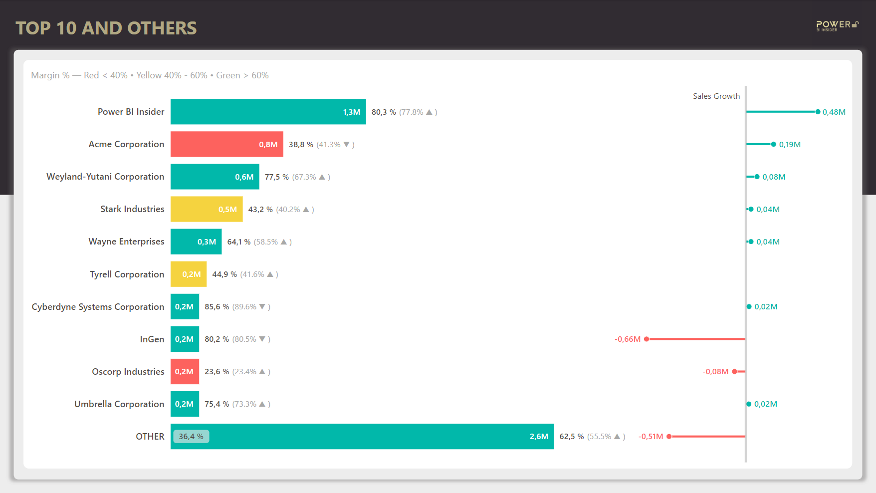
As you can see, using a bar chart opens a whole new world of possibilities (yes, it’s 100% built using a standard Power BI clustered bar chart 🤯)
No more rainbow colors — Instead, color is used with intention (to highlight profitability).
Comparing relative sizes — Instantly easier to understand with horizontal bars.
Additional information — This chart displays growth and profitability metrics on top of sales amount distribution.
Let’s take a closer look at the individual components of this chart so that you can fully grasp how much data this visualization packs.

The length of the bar is determined by sales amount. Data label inside the bar displays the sales amount.
The color of the bar is determined by the gross margin % (Yes, even a high sales customer can be bad business).
The data label outside the bar displays gross margin % for the customer, and also gross margin % for previous year to understand if the profitability is improving.
The percentage next to OTHER category highlights the share of sales for customers outside of top 10.
The additional lines on the right display sales growth compared to previous year.
Now, there simply is no way in this planet 🌍 you could pack this much information to a pie chart!
What can you learn from this chart?
Now, to the most interesting part of this post: what can you learn analyzing this bar chart?

The biggest customer, Power BI Insider, has a great sales growth and also the gross margin % is improving. Whatever you’re doing, keep doing it! 🚀
The top 2 customer, Acme Corporation, has a bad gross margin %, and it has even decreased from previous. Yet, sales is increasing. Is this really what you want? ⚖️
Top 4 customer, Stark Industries has gross margin % on yellow, but it’s improving so give it some time. ⏳
Top 8 customer, InGen, has negative sales growth of -0,66M, which means it was a top 3 customer previous year. What happened there? 🤔
Top 9 customer, Oscorp Industries, has a bad gross margin %. What’s the justification for doing business like this? This isn’t a charity after all. 💸
The OTHER category has a considerable drop in sales, but it seems the gross margin % is improving a lot. Maybe not the most worrying finding? 📉
At this point, it should be pretty obvious you cannot even compare this chart with the pie presented earlier in this post.
That’s a wrap for today, see you next time!