


This Power BI Profit & Loss Table Will Give You Goosebumps
100% dynamic control over rows, columns & formatting using only visual level filters

Profit & loss tables can be boring, ugly, and inflexible.
But you can also transform your P&L tables into a functional piece of art 🧑🎨🎨 if you just know what to do. But even if you don't, you've stumbled into the right place, as this article will teach you everything you need to know about building an amazing P&L summary table in Power BI. I guarantee this will be the highest return you get on your attention today!
Just take a look what this table can do 🤯
Analyze period, year to date & full year result ✅
Compare to budget & previous year ✅
Highlight difference vs budget & previous year ✅
Switch display units between actual, thousands & millions ✅
Select rows & column to display ✅
Hand pick rows to highlight ✅
Control everything with visual level filters ✅
Jaw dropping formatting ✅
All packed in a native Power BI table visual ✅
Too good to be true? Not this time. Let me show you how it’s done!
The Data Model And Basic Profit & Loss Measures
The data model behind this example is really simple.
In the starting point it only contains two tables: one fact table (P&L data with actuals and budget) and one dimension table (Date). On top of this data, I’ve calculated a bunch of base measures such as Sales, Cost of Goods Sold and Gross Profit to name a few.
Each of the base measures refence a disconnected table called Display Units to control if the result should be displayed as millions, thousands, or the actual value.
I’ve also added multiple versions of all base measures based on what I want to analyze:
Scenario — Actual, budget, and previous year
Time Range — Selected period, year to date, and full year
Comparison — Actual against budget & previous year, both absolute and in %
After you have the basic data and measures in place, you need a way to visualize the data.
Create P&L Layout Table To Control The Rows
If you’ve ever tried to build a P&L layout in Power BI, you know it’s a nightmare.
In this example I’ve solved the problem by using another disconnected table called P&L Layout. This simple table is created using the Enter Data feature in Power Query and has just two columns:
RowText — The P&L row text to display in the table (entered manually)
SortOrder — To make sure the rows are displayed in correct order (Don’t skip this part if you don’t want to infuriate your CFO🤬)
After loading the table into your model remember to set the Sort by column setting in Table view.

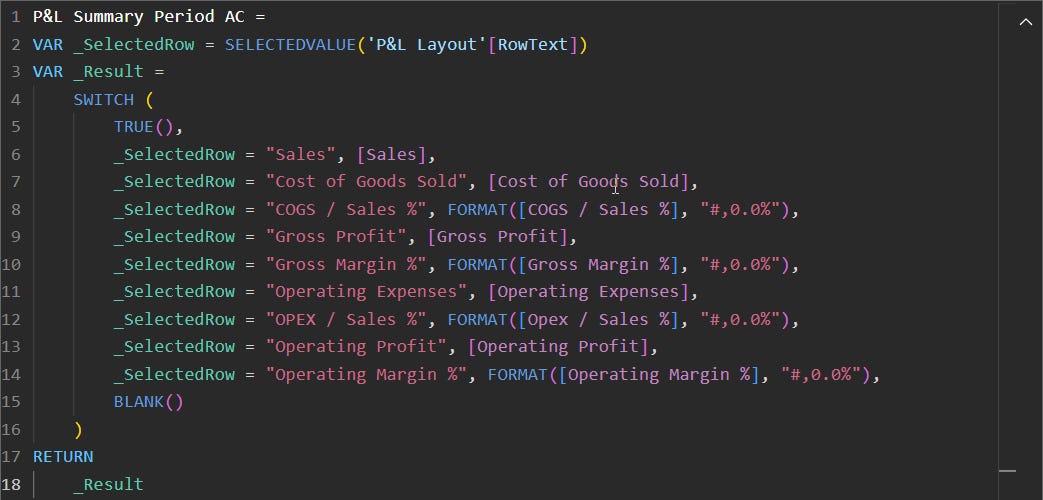
Since the P&L Layout table is disconnected from the main fact table, we need special measures to check the current row in the table visual and return the correct result. As some of the results should be displayed as percentages, you can use the FORMAT function to precisely control how the output should look like.
You need to have these “special” measures created for all scenarios, time ranges & comparisons. Here’s example of the measure that returns the actual values for selected period.
This table also contains two Divider measures that are later used to create horizontal breathing room between the main categories in the table. You can copy paste a proper empty character from this website.

At this point you might be wondering how on earth do you control the columns using only visual level filters. The answer: Field Parameters.
Create Field Parameter To Control The Columns
You can create a Field Parameter from the Modeling tab in PBI Desktop.
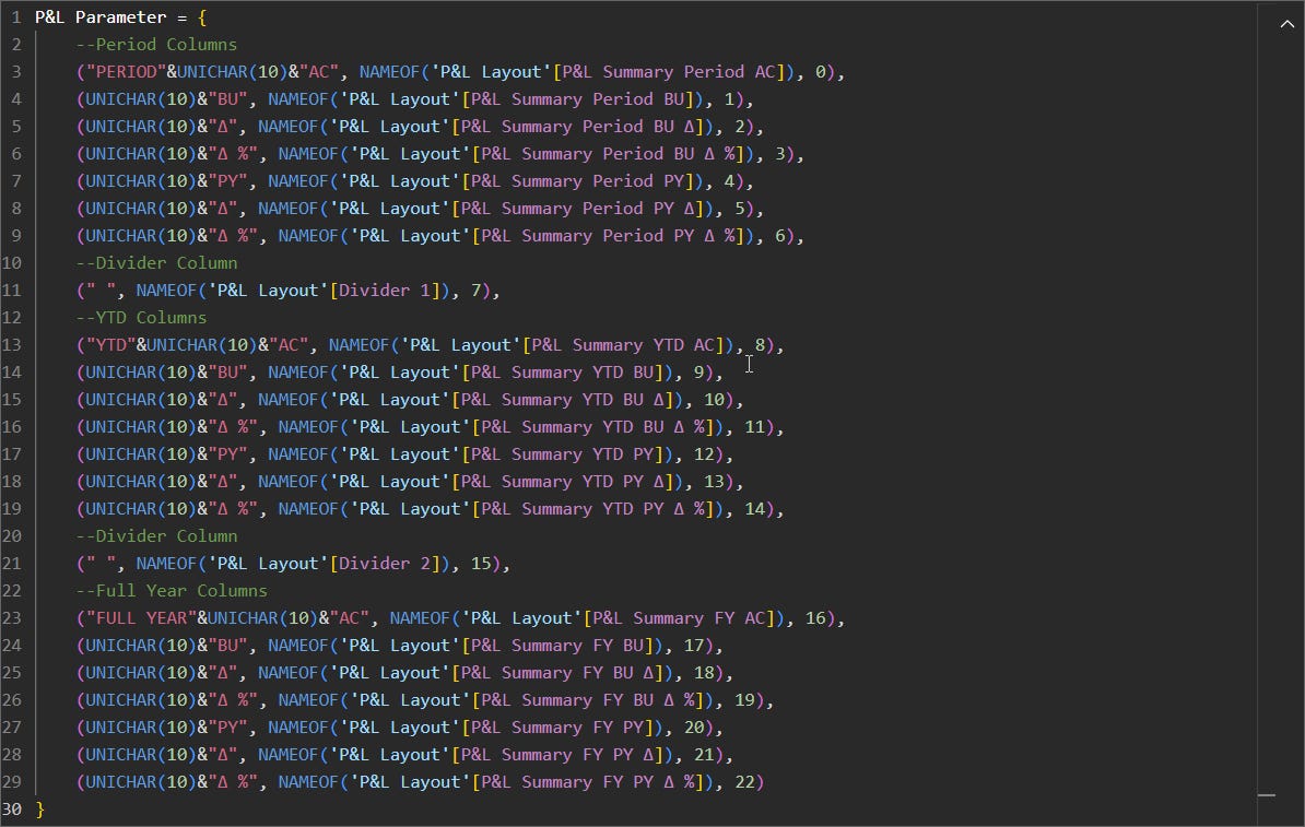
I’ve chosen to name the parameter as P&L Parameter, but the name doesn’t really matter. What’s important is that you add all P&L layout measures to the fields section of this parameter and hit the Create button (you don’t need slicer on the page).
Power BI will then automatically create another disconnected table and some autogenerated DAX, which we need to tweak a bit to make the P&L table column headers pixel perfect👌.
Rename Column Headers — Make sure to rename the columns exactly as you would like to display them in the table (For example uppercase everything & make divider column headers blank)
Force Line Breaks — Use UNICHAR(10) to force line breaks (used to display only PERIOD, YTD & FULL YEAR on row 1 and everything else on row 2)
Now we’re already quite close to the final solution but we still need a way to dynamically control the formatting of the rows.
Create P&L Highlight Table To Control The Formatting
You would assume highlighting a full row is child’s play in Power BI, right?
Unfortunately, that is not the case. Power BI only provides the option to control specific columns, not specific rows. However, if you conditionally format background color and font color of each column identically, you can achieve a full row highlight effect🪄.
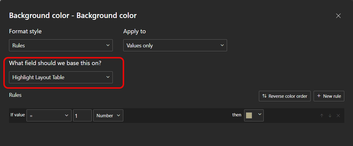
For this, you need a table you can filter to choose which rows should be highlighted.
It’s not possible to use the existing P&L Layout table for this because that would filter the visible rows in the table. What you need is a copy of the P&L Layout table. The easiest way to achieve this is to create a Calculated Table with following simple DAX:
P&L Layout Highlight = DISTINCT ( 'P&L Layout'[RowText] )After creating this Calculated Table, the data model is complete and looks like this in its final form 👇
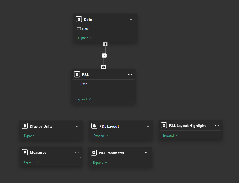
Since the complexity of the model starts to add up, let me quickly summarize the purpose of each table:
Date — Dimension table with all dates
P&L — Fact table containing actuals and budget data
Measures — Disconnected table containing all base measures
Display Units — Disconnected table used to control base measure display units
P&L Layout — Disconnected table to controlling the rows of the table
P&L Parameter — Disconnected (field parameter) table controlling the columns of the table
P&L Layout Highlight — Disconnected (calculated) table to control row highlighting
Now, back to the topic of highlighting the rows.
To apply the conditional formatting, you need to use the Cell elements section in formatting pane in combination with a measure designed specifically for this use case.
Remember to add both background color & font color formatting to each column.

The cool thing about this is that when you combine field parameters and conditional formatting, Power BI will remember how each column should be formatted. This means you can remove and re-add columns to the table and retain the all the formatting settings.
Perfect for this use case! 🤌
Add Finishing Touches
Now, to make this solution complete, there’s still a few details you should think about, both from design and functionality perspective:
Colors, Fonts, Padding — Pay attention to these details to create a polished design
Alignment — For professional look🤵, align your values and column headers
Rename & Hide Filters — Rename the visual level filters to clearly describe the purpose, for example “Select Rows” or “Highlight Rows”. Also hide visual filters that are not needed.
Auto-size Column Width — As you might change the display unit of the calculations, remember to enable the auto size column width for best user experience
Rename First Column — The first column “RowText” doesn’t need to be displayed, so simply rename the column with a single space to “hide” it
Add Help Tooltip — Add clarity for example by explaining what AC, PY, and BU stand for in the help tooltip
Dynamic Subtitle — Add a clear subtitle stating the selected period and chosen display unit & currency. Simple to add with a measure but makes all the difference.
Finally, if you need inspiration how to use this amazing P&L table, check out this article to learn how to use Power BI & PowerPoint together in a creative way!
Hi Sorry I was just wondering if it was possible to conditional format the values based on a rule.
I.e if the value shown is <0, show this as red, otherwise show it as black.
I can't figure out what the dax would be to be able to add it to the cell elements font colour.
Thanks
Thanks Lasse, all good. I figured out what I was doing wrong anyway! Thanks again.