
How To Build The Ultimate Benchmarking Bubble Chart With Custom Diagonal Lines
Take your visualization to the next level

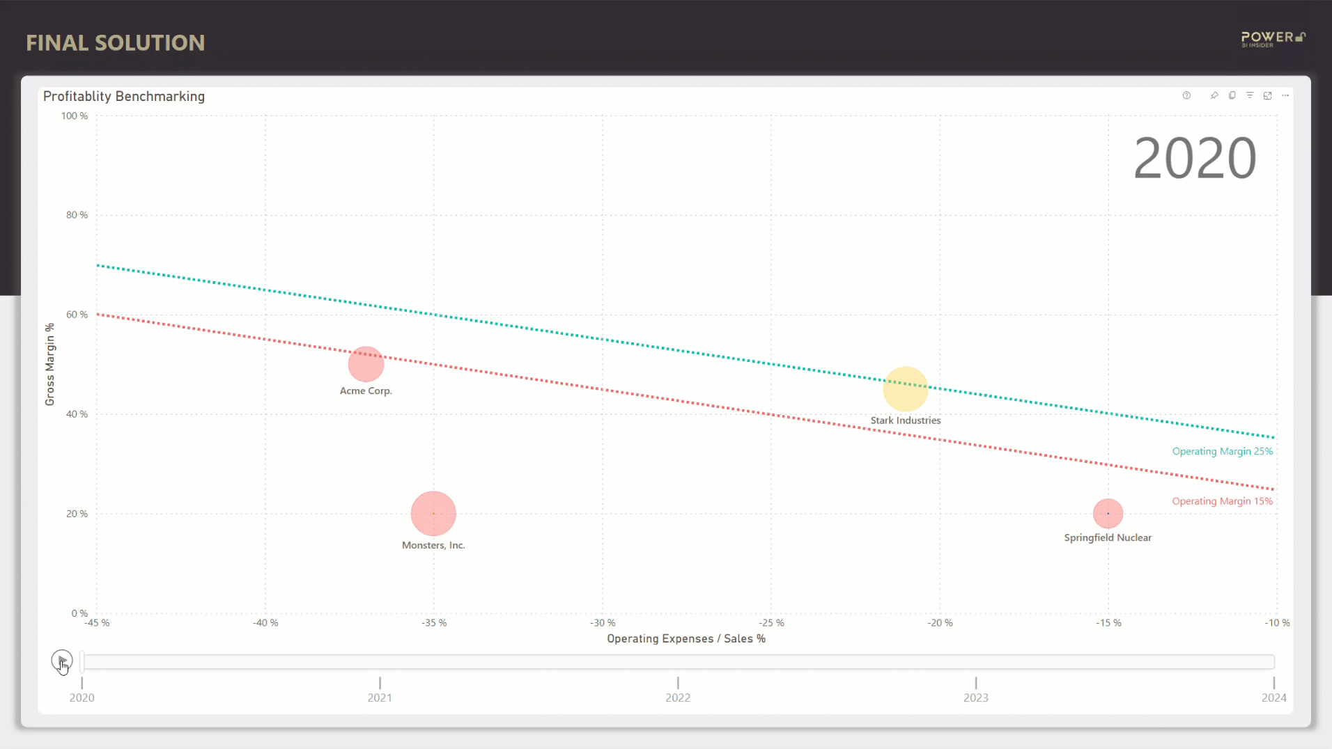
Are you using a benchmarking chart that looks like this 👇
If not, after reading this post you will be.
The bubbles you see are built using a native Power BI scatter chart (with some added spices 🌶️). Eager to find out how it’s done? Then keep on reading!
This post consist of three main sections:
What makes animated bubble chart the best benchmarking visualization
Using bubble chart to understand business profitability
How to technically create the chart (the largest part of this article)
Let’s go!
What makes animated bubble chart the best benchmarking visualization
Answer: it’s easy to understand.
Scatterplots interact with our visual system, which is lot faster at processing information compared to our verbal system. We intuitively absorb colors, shapes, and movement in the blink of an eye, making it easy to understand complex information quickly.
Here’s a few examples of the individual elements that enable this
Position — Are the bubbles under or over the reference lines
Color — Is the color of the bubble red, yellow, or green
Size — Is the bubble big or small
Movement — Track development with animation and the trailing line
Context — Which year are we talking about (top right corner)
Details — Additional information on demand by hovering mouse over the bubble
Pair all of this with interesting data and you have a powerful visualization in your hands.
Speaking of which, let me break down the example use case of today's article.
Using bubble chart to understand business profitability
One of the main objectives of running a business is to make money.
But it’s not enough to have sales. You also have to make profit. And if you don’t understand how profitability works, you wont make any money. Simple. So let’s see how we can use bubble chart to understand profitability.
For those of you not familiar with finance terms, let me give you a quick 101 🧑🎓
Sales — The money you get from customers.
Direct Cost — The cost of the product or service you sell to customers.
Gross Profit — The difference between the sales and direct cost. If you buy the product for 40€ and sell it for 100€, you make 60€ in gross profit.
Gross Margin % — Gross profit presented as percentage of sales. If you make 60€ in gross profit and 100€ sales, it means 60% in gross margin.
Operating Expenses — Other expenses not directly related to product, like salaries for employees and rent for premises (usually presented as negative number).
Operating Expenses / Sales % — Operating expenses presented as (negative) percentage of sales. This is a measure of efficiency, meaning how much cost is required to generate the sales.
Operating Profit — The profit on the bottom line after you’ve paid all expenses.
Operating Margin % = Operating profit presented as percentage of sales. A measure of how profitable the business is. If you make 20€ in operating profit and 100€ sales, it means 20% in operating margin.
Not too hard to understand, right?
Now to dive deeper, there are two main ways you can make a business profitable (= high operating margin %).
Have a good gross margin % = Buy cheap, sell expensive (I know, super complex 🤯).
Have low operating expenses / sales % = Run low cost operations from your mom’s basement with just you and your laptop.
Now that we’re familiar with the main ingredients of profitability, we can put those in a scatterplot.
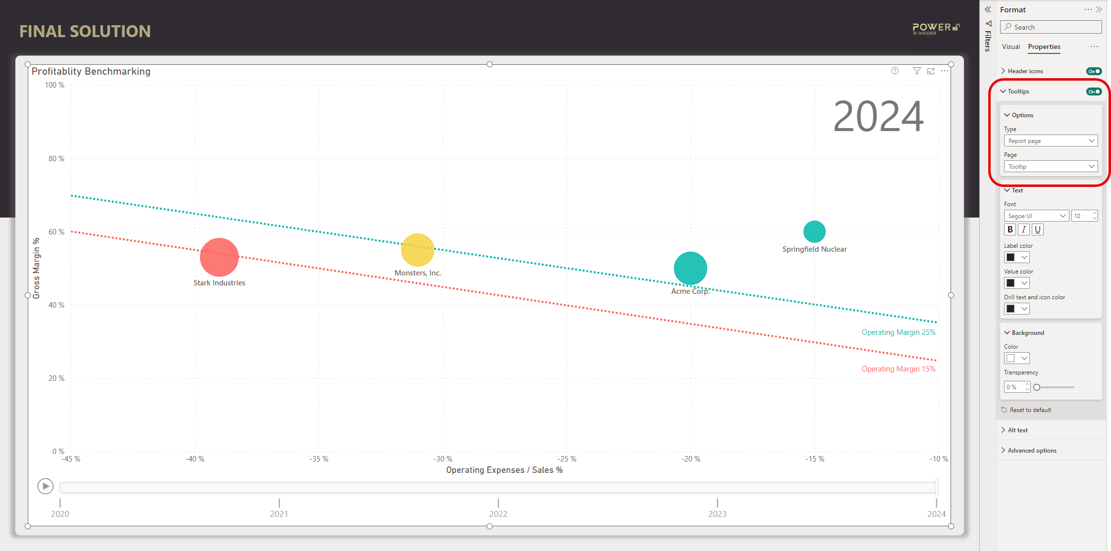
In the example chart in the beginning of this article each bubble represents a company. The size of the bubble is determined by sales. The vertical (up-down) position of the bubble is determined gross margin %. The horizontal (left-right) position is defined by operating expenses / sales %. And finally, the color of the bubble is determined by operating margin %.
The goal is to move the bubble to the top right corner ↗️ (high gross margin % and low operating expenses / sales %).
With the bubble chart you can easily answer questions like:
Is the business profitable
How does the profitability compare to other similar sized companies
How has the profitability developed over the years
Is the driver behind profitability development gross margin %, operating expenses / sales %, or both
Okay, but enough of this financial preaching, you came here for the Power BI chart.
How to technically create the chart
There are 4 main steps to create this chart:
Add scatterplot to the canvas and add data to the chart.
Add dynamic conditional formatting to the bubbles.
Add the custom diagonal reference lines.
Create a tooltip page to be displayed when hovering over a bubble.
Let’s move right into the first step.
Step #1: Add scatterplot to the canvas and add data to the chart
First off, add Scatter chart into the canvas (highlighted in the below picture).
Then, populate Values, X Axis, Y Axis, Size and Play axis. I will skip the part of how to create these measures because I’ve already covered that in previous articles you can find from here.

In this example I’ve used Year column in the play axis, but you could of course use any other time dimension as well. Just remember to use a proper date table!
You can also customize the marker size to make the bubbles the size you want.
Step #2: Add dynamic conditional formatting to the bubbles
To add dynamic formatting to the bubbles you need to know what is considered good or bad.
In this example I’ve decided that if operating margin % is over 25%, then the bubble should be green, and if it’s less than 15% the bubble should be red. Obviously, if the operating margin % is between 15% and 25% the bubble should be yellow.
Some visualization pros might advice against using the “traffic light”🚦 coloring, but that is something that everyone can understand, which is the only thing that matters if you ask me.
Here’s the DAX code for the dynamic formatting.
Scatterplot Colors =
VAR _OperatingMargin = [Operating Margin %]
RETURN
SWITCH (
    TRUE(),
    _OperatingMargin >= 0.25, 1,
    _OperatingMargin >= 0.15, 2,
    _OperatingMargin < 0.15, 3
)
After creating the measure, use it to conditionally format the bubbles with the help of the following support picture.

Step #3: Add the custom diagonal reference lines
Ok, time to reveal the magic trick 🧙
I'm guessing some of the more experienced Power BI users reading this have been impatiently waiting to learn how this part is done, as these lines cannot be added using measures or columns.
Hmm…
Maybe those are added as simple line shapes over the chart? Nope. Nice try, but if do that and embed this visualization in a Power Point presentation, the lines will not follow. It needs to be a part of the same visualization.
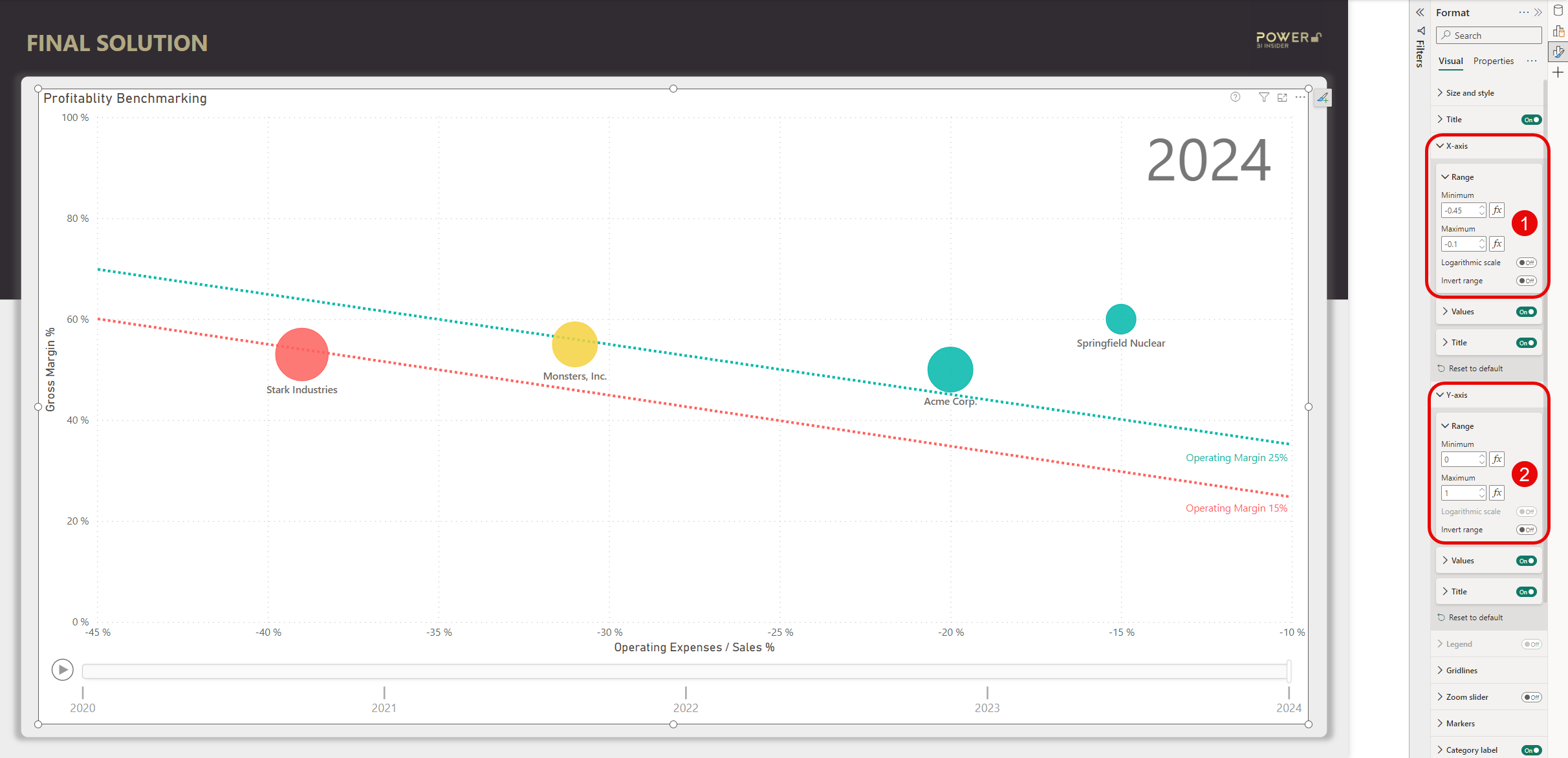
The way to fix this is to use a custom background image and place it as the Plot area background.
The only compromise you need to do with this technique is to lock the axis values on both X and Y axis. This needs to be done to make sure the reference lines stay in the correct position. Obviously, you need to be familiar with the range of values present in your data to do this. In this example I’ve locked the Y-axis values to minimum 0, and maximum 1. And the X-axis is locked to minimum -0,45 and maximum -0.1.
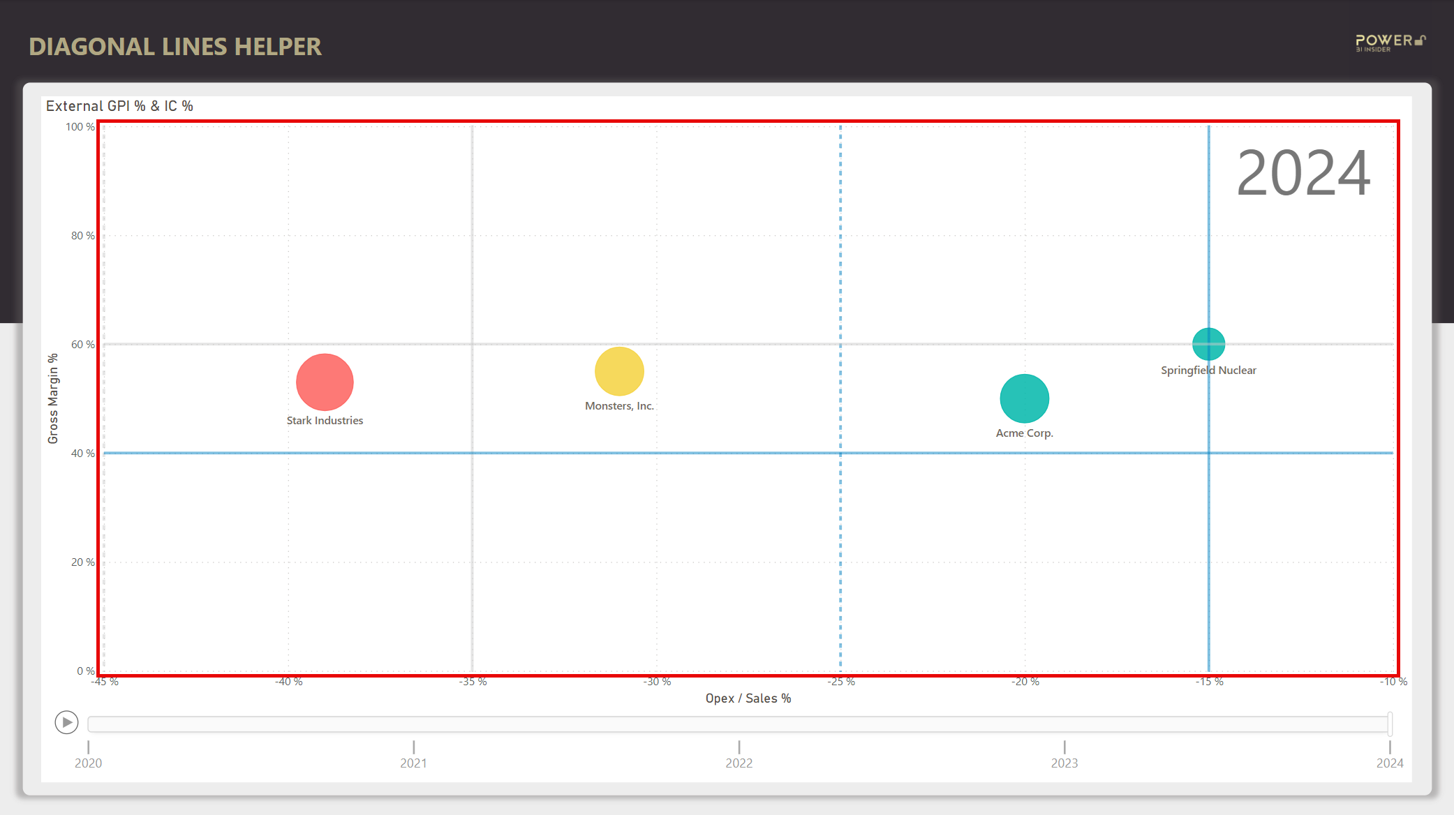
Next, you need to know the position where you draw the lines.
Fortunately, to draw a straight line, you only need to connect two data points. This can be easily calculated in Excel. In the context of this example, the only thing we need to know is a random gross margin % data point (this could be basically any value in your Y-axis range), and the operating margin % targets for both upper and lower reference lines.
With the help of the Excel file, you need to add two reference lines to Y-axis, and four reference lines to X-axis. These lines will be used to position the diagonal lines in the next step.

After you’ve added the reference lines you need to take a screenshot of the plot area. This area is highlighted in the next picture. Try to be as precise as possible 🔎 using the light grey lines on the sides of the plot area as help.
Next, open Power Point where we will create the custom background image.
After you’ve created a new Power Point file, add the plot area screenshot image to a blank slide. Using the reference lines as help, add two line shapes and place them on top of your screenshot according to the example below.
Finally, format the lines as you want (I’ve used green and red).

Once you’re done with formatting the lines, you need get rid of the picture on the background.
But don’t delete the screenshot, instead make it transparent. This will make sure the background will properly snap into place when we take this back to Power BI Desktop.
Below example how your slide should look after you’ve changed to transparency to 100% using the format picture pane.

The final step in Power Point is to turn these three shapes into a picture.
To do this, press Ctrl + A combination which will select all objects on the slide. Then, using right mouse click select the option Save as Picture. From the save menu, change the picture type into Scalable Vector Graphics (svg) and save the picture in the location of your choice.
Then, head back to Power BI Desktop.
In Power BI Desktop, select the Scatter chart and add you svg file as the background in Plot area background.
Set the transparency to 0% and image fit to Fill. Now you should have the background with the lines perfectly snapped into place. At this point you can also get rid of the helper reference lines. You can either delete them completely, or make them transparent in case you need to come back to the previous steps.
Okay, we’re almost ready.

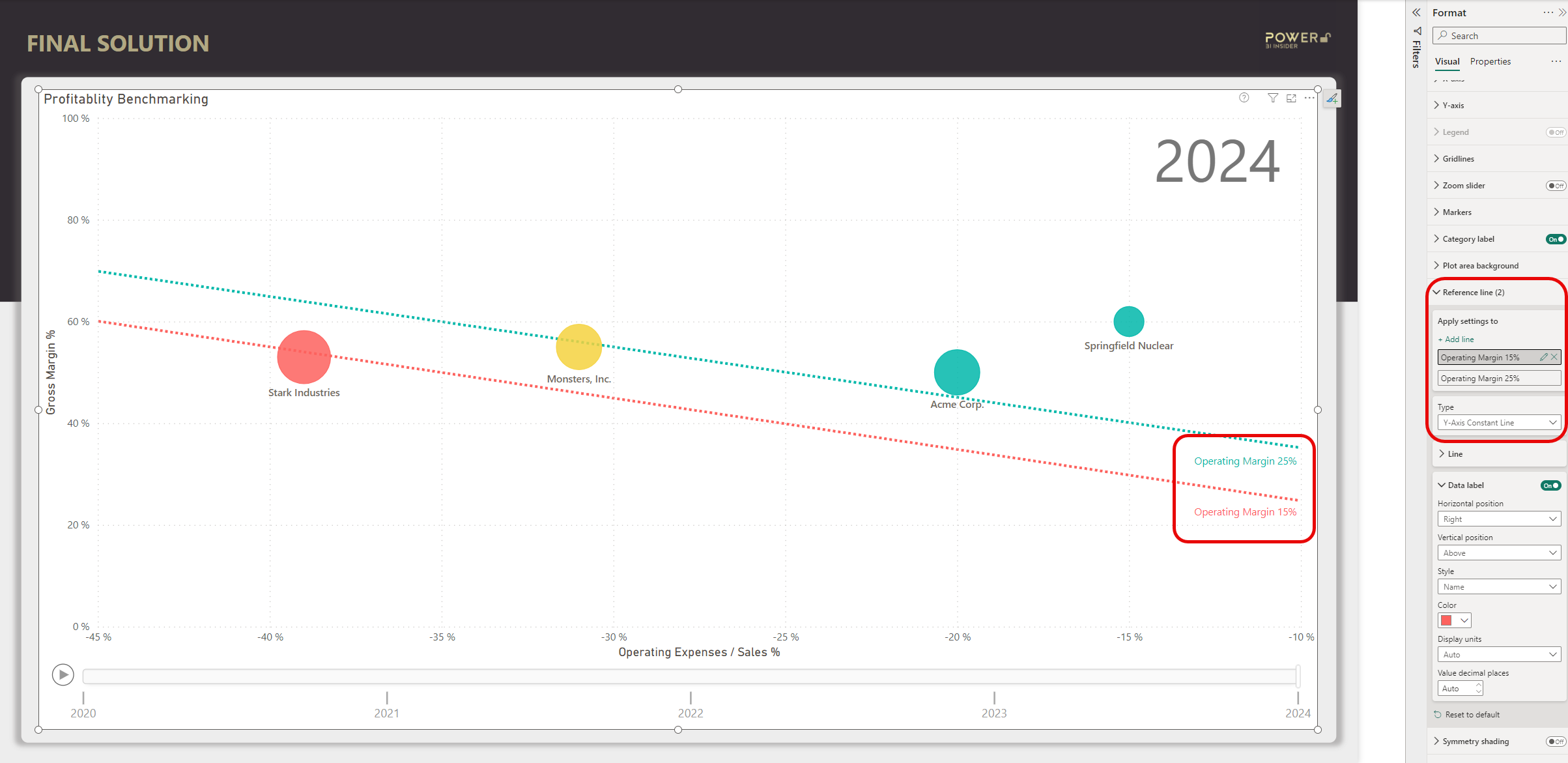
The last thing we want to add to the chart are series labels to the diagonal lines.
Without them, it might be hard for the end user to understand what these lines mean without the labels. In this example the lines stand for operating margin % target. To add the labels, simply add two new Y-axis reference lines but make the actual line transparent and only show the label on the right side of the chart area. Make the label same color with the line to make it obvious to which line the label belongs to.
To position the label, you can just play around and manually test which Y-axis value will place the label in a spot that looks the best.
We’re done with this monster step! Phew 😅.
Step #4: Create a tooltip page to be displayed when hovering over a bubble
But wait, there’s more! (Now I really start to sound like a shopping tv commercial)
This last part of adding the “on hover tooltip” is totally optional, but I think it adds a nice touch to make this the ultimate benchmarking chart.
It looks like this:

To set this up, follow these 5 quick steps
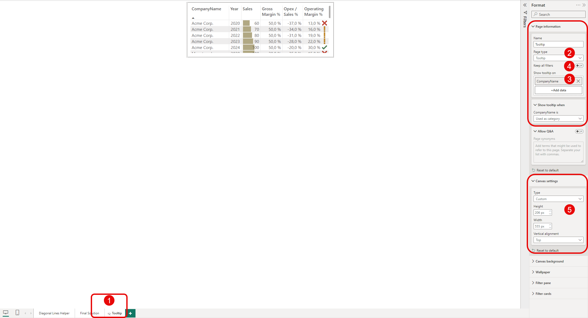
Create a new hidden page in Power BI Desktop
Change the page type to Tooltip
Add the category column you want to use to show the tooltip (Company in this example)
Toggle off Keep all filters (if you want to show details for all years on hover)
Design your tooltip on canvas and customize the page size to fit the visualization
Then go back in the page with your Scatter chart and enable the tooltip page.
All done! 💪
Now that you’ve managed to create this amazing piece of visualization, it would be pity if you didn’t know how to use it.
So to wrap up this article, here’s a few tips how you can get most out of using this ultimate scatterplot:
Press the play button to automatically play the animation for all years.
Click a bubble to draw the path of the bubble.
After clicking a bubble, press play to draw the path of a bubble, year by year.
To highlight the path of multiple bubbles, hold Ctrl while clicking the bubbles.
You can also click on the timeline below the chart to display a specific year.
Hope you found amazing value in this article!