


How To Build Insane BI Adoption Timeline Using Active Directory & Power BI Scorecard
Start tracking your way to data driven culture

Do you have a BI adoption tracker that looks like this?
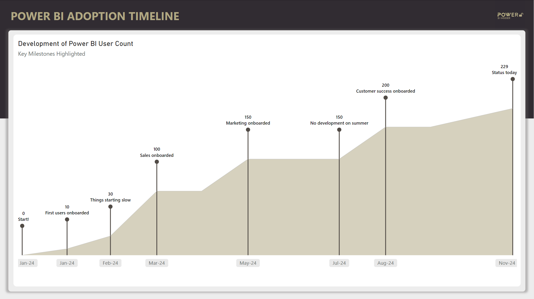
If not, you came to the right place. After reading this post you’ll have all the tools to build one for yourself. On the way you’ll learn how to:
Get data on Power BI users from Active Directory
Create snapshots of user development without IT
Input manual comments about key milestones directly in Power BI
Let’s roll up the sleeves and start building this beauty!
Step #1: Get Data From Active Directory
First you need some data about the Power BI users.
For this, we turn to the native Active Directory connector in Power Query. Yep, it’s been sitting there right in front of your nose all these years 😳.
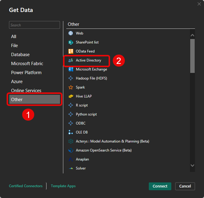
With this connector, you can get all kinds of information including a list of users that belong to the Power BI Active Directory groups. The only thing you need know is your company’s domain (and I trust you know for which company you work for? 🧐). If your company is not using AD groups for Power BI, you might also get this data by live connecting to usage metrics semantic model(s).
I won’t go through all the detailed Power Query steps here, but if you want to get your hands on the M-code, you can get it for free from my resource bank.
As a reminder, you get a link to the resource bank in the welcoming email when you subscribe to this newsletter. So new readers, you know what to do 👇.
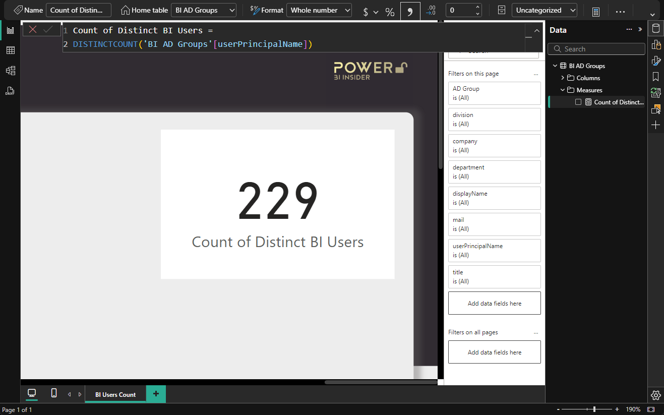
After loading the data to the pbix file, simply create a measure that counts the number of unique Power BI users and put it on a Card visual on canvas. We will need this visualization in a later step. Then publish this simple report into workspace of your choice and configure a daily refresh.
If you want to also track the percentage of BI adoption in your company or in some specific department, you need to create a second query to get the count of all users in your tenant.
Hmm, but hold up! Don’t we need snapshots to build a timeline chart, and this card only contains the most recent number?
Yep, you’re correct, that’s the problem we’re going to solve in the next step!
Step #2: Create a Scorecard In Power BI Service
One way to start tracking a KPI development is to create a Scorecard (also known as Goals or Metrics).
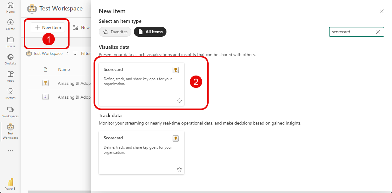
Creating one is simple. Just go to the workspace where you published the simple active directory report, click New Item (1) and select Scorecard from the list (2). When you do this, you will see two objects appear in your workspace:
Scorecard — The visualization layer of your Scorecard.
Semantic Model — The storage layer of your Scorecard.
Then open your scorecard, give it an amazing name (1), create a new Goal (2), and give also your goal a name (3).
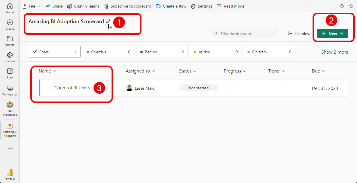
Ok, how do we get the number of BI users from the active directory report to this Scorecard?
Step #3: Connect Active Directory Report & Scorecard
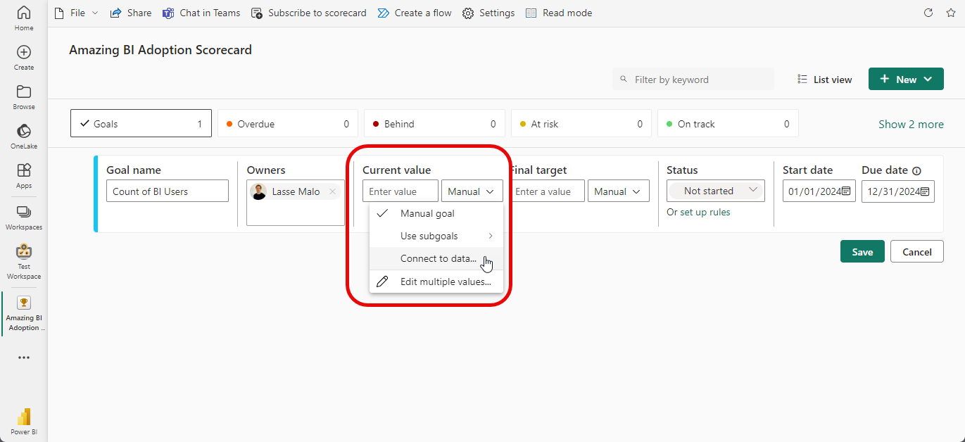
Open your Goal into edit mode, and in the Current value section choose the option Connect to data…
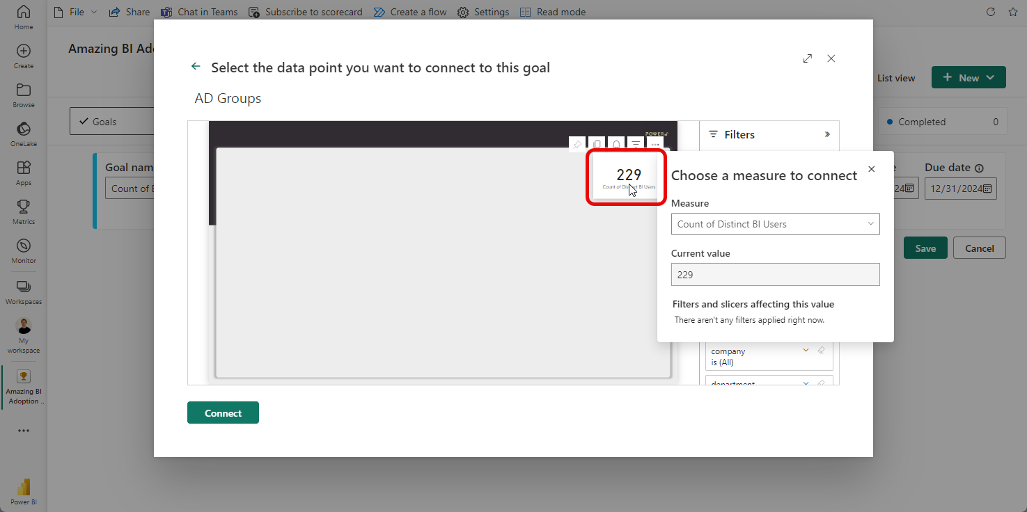
A menu called Select a report or app will open up. From there choose the All reports tab and search for your Active Directory report and click on the Next button.
Remember when I said you need to Card visual later? This is where we need it. Simply click on the Card and you will see an automatic reference to the “Count of Distinct BI Users” measure.
Hit Connect button! 🖱️
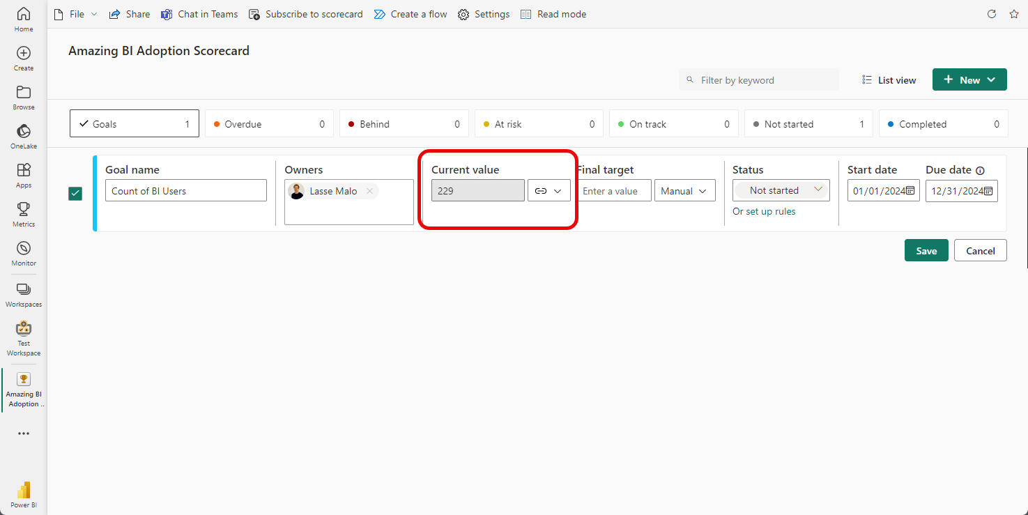
Now you should see a greyed-out number of appear in the Current value section of your goal, and also a link icon next to it indicating that this value connected to a report. Going forward a snapshot of this value will be automatically saved each day!
Perfecto! 👌
Now close the edit mode by clicking Save button under the Goal.
Then re-open the Goal by clicking on its name while on reading mode.
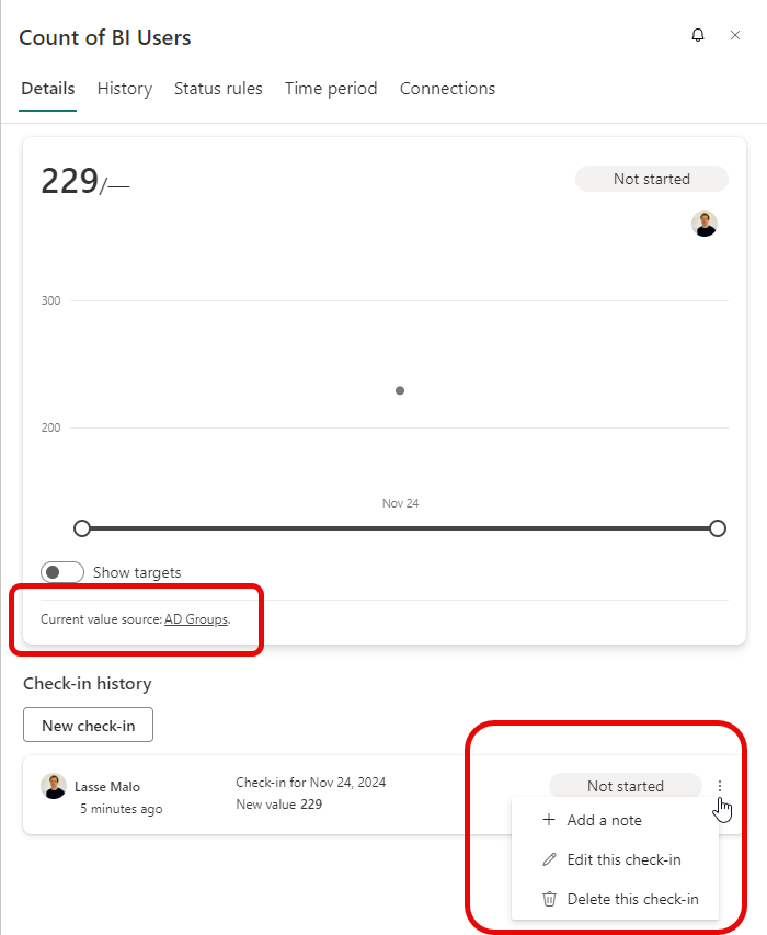
A details pane will open up on the right side of the screen. In here, you can see to which report this Goal is connected to, but also more importantly you have an option to edit the daily Check-in.
You guys see already where I’m going with this?
While it’s not possible to change the actual number when connecting to a report, you can always Add a note or change it later. This is exactly what we need to capture the context behind the increase in BI users and display it in our final visualization.
Now, to the fun part of this whole exercise!
Step #4: Create New Report With Live Connection To Scorecard Semantic Model
Did you know it’s possible to get data from a Scorecard Semantic Model to Power BI Desktop?
I didn't, until I had an epiphany on one sunny day wandering around in the middle of a forest 🌲 here in Finland. When I got back to my computer, I had to try it right away.
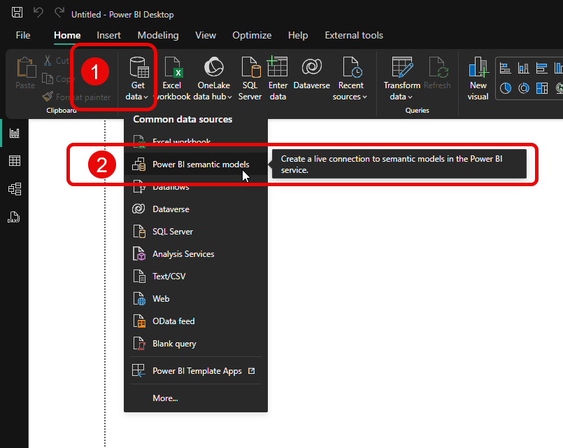
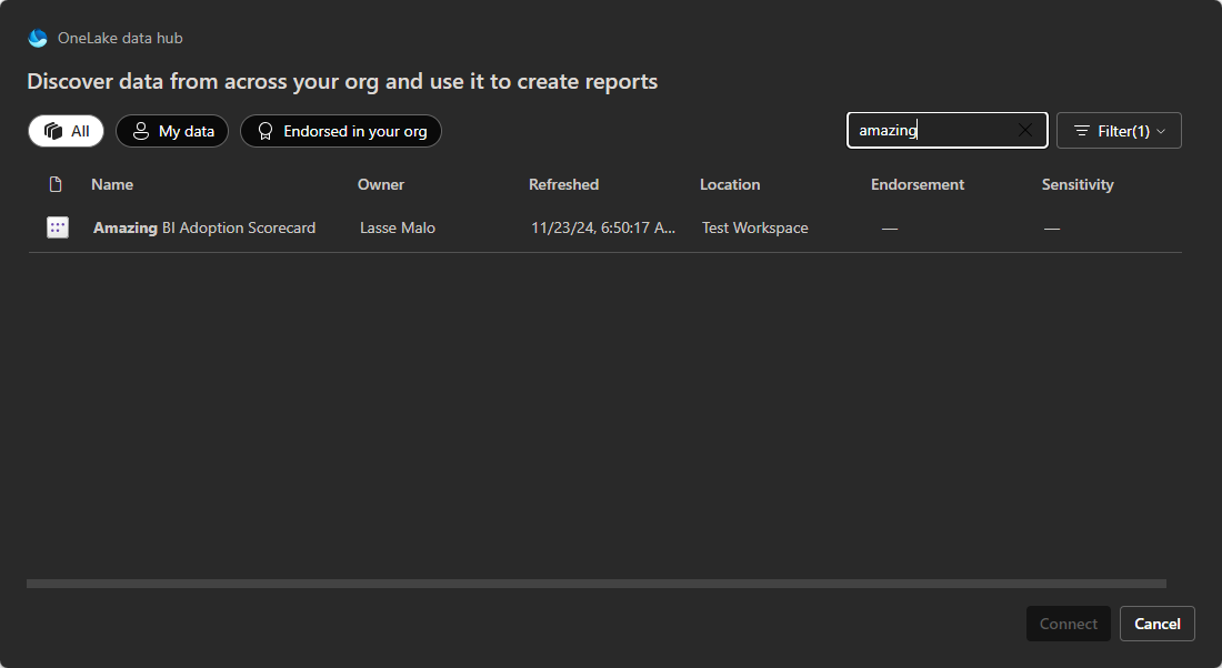
I wasn’t sure if the Semantic Models behind Scorecards will show up to the list but after searching with the keyword “Amazing”, to my delight, there it was! 🥳
However, my delight turned into disappointment about 3 seconds later.
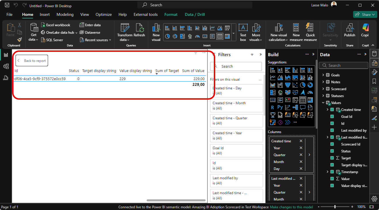
After building a quick table to take a look at the contents of the Values table, I found out that it’s completely empty. Nothing in it. Nada. Zero records. How could it be? After all, I can see the values when looking at the Scorecard in Power BI service 🤔.
You see, there’s a catch! (there always seems to be)
The Semantic Model behind a Scorecard in Power BI Service is not refreshed by default. You need to manually refresh it, or better yet configure a daily refresh to make sure the data in it stays up to date.
One quick refresh later, the data was there, and I was delighted again (what a rollercoaster🎢 of emotions!).
Fast forward a few Check-ins with comments and this is how the Goal details will look like in Power BI Service:
It’s worthwhile noting that you can always edit the comments attached to the Check-ins later if you need to (or add multiple comments to the same Check-in).
But now what?
Step #5: Build The Adoption Visualization
With access to data fixed, finally, it was time to start creating the actual visualization.
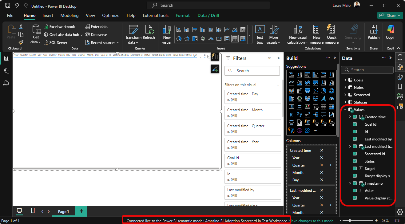
After doing quick research on the data model structure, I found out that Values table contain the development of the Goal, and Notes table contain the manual comments added to the Check-in values.
Here’s how the model structure looks like 👇.
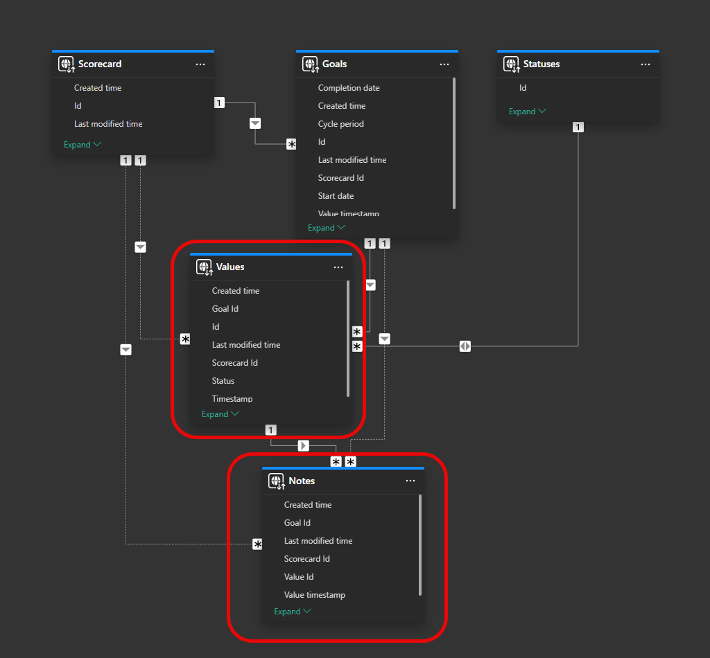
One thing you might notice here is the absence of a proper Date table. But we just have to live with it since this is an auto-created model. But now to the visualization part…
I took inspiration from this How to Power BI video. If you haven’t subscribed to content created by Bas, you should, the guy is a true wizard 🧙♂️. As this post already grew too long for email, I will just outline the main steps I took to build the final visualization (I will also add this example pbix to the resource bank mentioned earlier).
Use native line chart
Place column Timestamp from Values table to X-axis
Create measure for Goal value using Value column in Values table
Place the Goal value measure to Y-axis
Use shade area and choose color of your liking
Comments
Create new measure for Note value (to place the pin 📍 on correct height)
Make sure Note value is only displayed if there is a Comment on the selected day
Place Note value measure to Y-axis
Turn off the line
Keep the markers visible, choose type, color & size
Turn on data label and change it to display Goal value (not Note value)
Create measure for Note (the actual manual comment
Display Note on data label detail for Note Value
Error Bars
Enable only for Note value
Choose type By percentage and set Lower bound to 100%
Choose Bar color & Width
Declutter
Turn off all Gridlines
Turn off all axis values and titles
Add padding to the visual
Month Labels
Create new measure Note Value Zero (to place the year month label on below X-axis)
Turn off the line & markers to hide it completely
Always return a fixed negative result, for example -2 and make sure Note Value Zero is only displayed if there is a Comment on the selected day.
Create measure Selected Date and use FORMAT to control how the label looks like. For me its “mmm-yy”.
Display Selected Date as data label for Note Value Zero
And that is it ladies and gentlemen! Pretty sweet🍬, isn’t it? It’s truly amazing how much flexibility the native Power BI visuals provide.
Let me know in the comments if you’ve built something similar yourself.
Until next time!🫡
Hi, I don't have access to the newsletter resources, they mention that the link was sent in an email when I subscribed to the newsletter, but I can't find it, maybe I deleted it by mistake, could you please resend it to me again?