
Heatmap Formatting Masterclass For Finance Pros
A proven framework to instantly facelift your tables

Analyzing data in table format requires a lot of brain power 🧠.
You need to put your verbal system to work and read the data row by row in order to find interesting data points. But it’s also possible to flip the script and move the processing load to the blazing fast visual part of the brain by using heatmaps.
Today you’re going to become a formatting master and learn how to build this 👇

The Starting Point & General Improvements
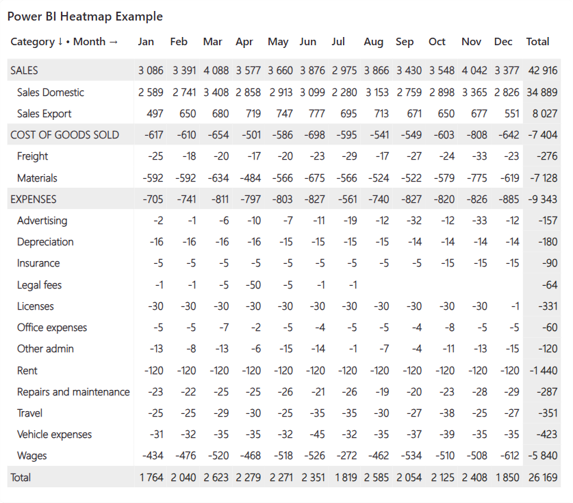
Our example today is the most common table on earth 🌍: profit and loss statement.

But don’t let the simple look of it fool you. P&L statements are trickier to format than most tables for two reasons:
Values can be either positive or negative depending on the category (income categories are positive and cost categories are negative).
Categories contain vastly different magnitude of numbers (yet it’s often important to know when any of the categories is showing unusually high or low values).
With that said, let’s see what happens if you just enable the standard conditional background color to the matrix.

Well… that did not help at all… 😅
Since the values in Sales Domestic row are much higher than all other values, it’s the only row that gets truly highlighted and everything else looks almost identical. Fortunately, this can be fixed by customizing the conditional formatting.
But before we do that, let’s apply improvements to the base look of the matrix.
Title — Choose font, size and color (I like to use dark grey instead of black).
Grid — Change border color to light grey & add 5px padding to create space.
Values — Turn off alternate background color & choose better font (I’ve recently started using bolded Segoe UI Light after discovering great Power BI content on LinkedIn by Nicholas Lea-Trengrouse).
Rename — Add light arrows (↓→) to the measure name in values section to clearly label row & column headers (this pro tip comes from Jason Davidson).
Size & style — Add 10px padding to all sides & round the corners.
Row headers — Use same font as values and disable +- icons.
Column headers — Choose font that is slightly bolder than the values.
Specific columns — Remove value decimal places to eliminate visual clutter.
Row & column subtotals — Add light background to separate totals from values.
After these changes, the matrix looks much better👌(at least if you ask me).
Customizing Conditional Background Color
Next, let’s add back the background color, but this time with custom settings.
In the below picture you can see I’ve used the Gradient background coloring option paired with a custom DAX measure called Heatmap Formatting which in a nutshell normalizes all results to the range of -1 to 1 instead of the actual values displayed in the matrix.
The pbix file with the specific DAX measure is available for all subscribers.

The most important part is to pay attention to the shade of colors🎨 used.
After trying probably hundreds of different combinations, I’ve come to the conclusion that either the maximum or minimum color needs to be white (#FFFFFF), and the middle color needs to be light grey (#EDEDED). The exact color you decide to use on the other end of the spectrum is irrelevant as long as it’s a darker shade and you think it looks good (in this example I used #006192).
Applying conditional background color like this creates “lighter” experience to your eyes as not everything is formatted with a dark color.

While the background coloring is now much better compared to the default, another problem appears: you cannot see the data values that have both dark background and font color.
But don’t worry, help is on the way.
Customizing Conditional Font Color
The key to great heatmap formatting is to apply conditional color also to the font.
To add it, it’s best to reuse the same measure that is also being used with the conditional background color, but this time the format style is based on Rules.
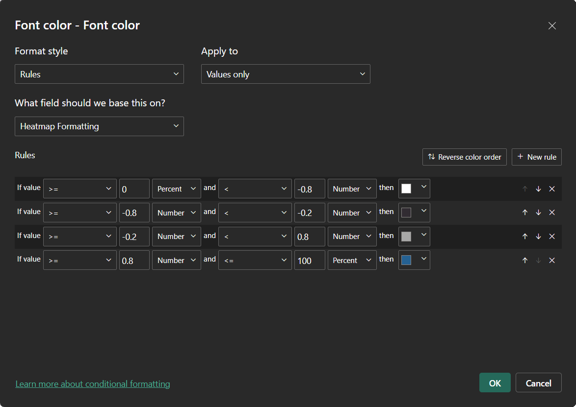
As you can see there are 4 distinct categories to format the font (remember that the Heatmap Formatting measure always returns values between -1 and 1).
Between minimum and -0.8 — Since the background color for this range will be very dark, it means the font color needs to white (#FFFFFF) which is the opposite.
Between -0.8 and -0.2 — The background color is still dark, but not as dark as the minimum. In this range the dark grey (#312C32) that is used in column headers works great as it makes the values visible while making it stand out less compared to the white font color.
Between -0.2 and 0.8 — Now the background color has turned light grey which means a slightly darker grey (#A8A8A7) works well to display the values without emphasizing them too much.
Between 0.8 and maximum — For the last category the background color is going to be white. That means these values are “unusual” compared to the middle values and should be somehow highlighted. A great option is to use the same dark color you decided to use for the dark background color (#006192).
Now the formatting is complete as shown in the beginning of this post.
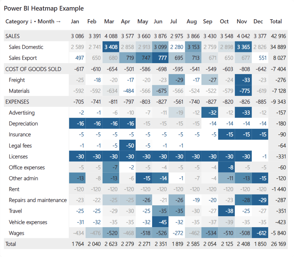
The Purpose Of Conditional Formatting
Before ending, I would like to remind you about one☝️ important thing.
The purpose of conditional formatting is to drive attention where you want it. In this example the point was to highlight unusually high and low values in each category and de-emphasize all values that seem to be normal on a month-to-month basis.
This is easier to understand with examples.

Sales Domestic — Both the best and worst sales months are super easy to spot.
Licenses — The value in December seems to be an outlier compared to all other months which means the whole row gets highlighted (this is exactly what I want in this example).
Rent — Even though the absolute Rent values are much higher than some other categories, it doesn’t need attention as the values are 100% constant each month.
That said, it would be completely valid to change the logic and instead highlight values based on how much they contribute to the total result. It all depends on what you want. Just remember to NOT highlight everything.
Let me know in the comments what you think about the framework!
I also use something similar, but in the submitted article everything is described comprehensively, i.e. all properties of all related elements. Simple instructions with high visual impact. Thank you and keep it up!
There is no download pbix link. Please share the same. Thanks